Zvuk Business / Brand systems · Illustration
Visual storytelling for B2B music
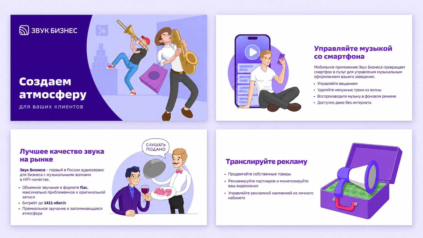
Zvuk Business provides music for commercial spaces. I adapted inherited brand elements into a practical B2B communication system and created a visual narrative that could explain abstract ideas across industries.
Brand Designer | Illustrator
2020–2023
- Visual system
- Illustration library
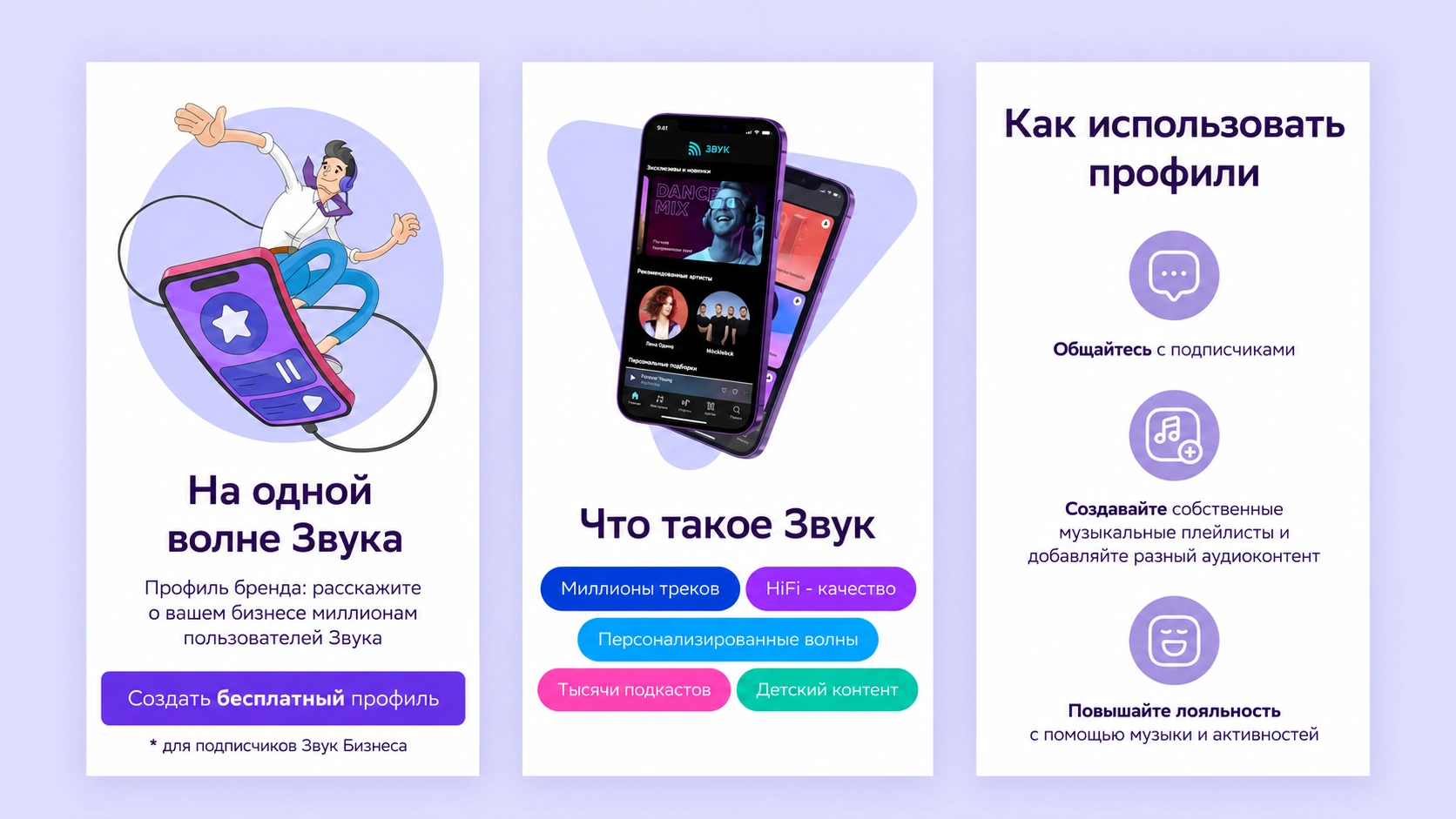
- Web & sales presentations
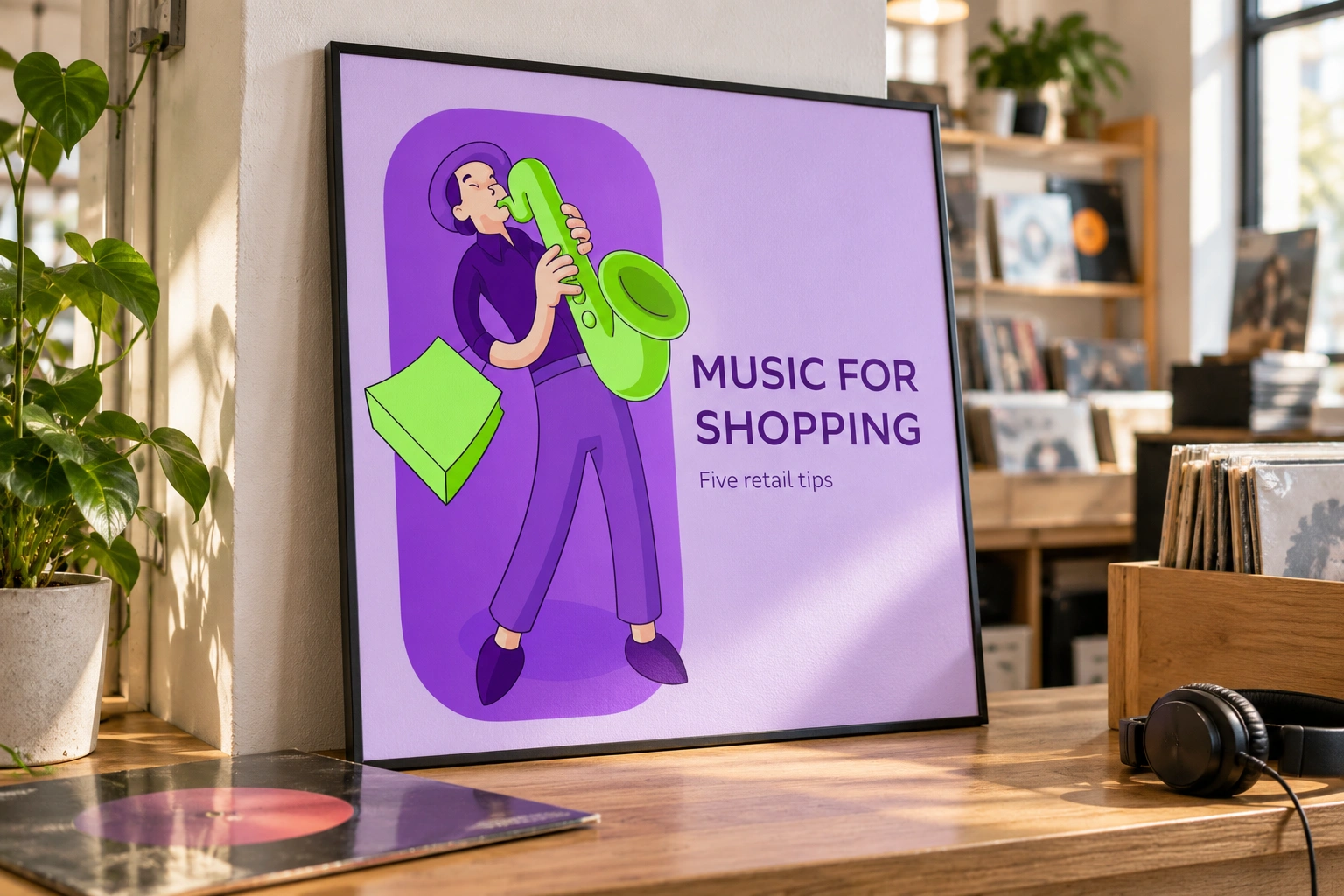
Presentation mockup based on original Zvuk Business artwork.
The challenge
Music for a business is an invisible product. The brand needed to explain atmosphere, customer experience, and industry-specific use cases without falling back on generic personal-listening imagery.
My contribution
I built a visual language around inherited brand resources, developed illustration guidelines and reusable assets, and applied them with marketing, product, and sales across everyday communications.
Turn inherited assets into working rules
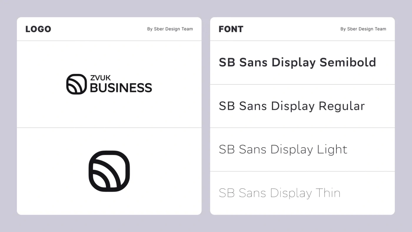
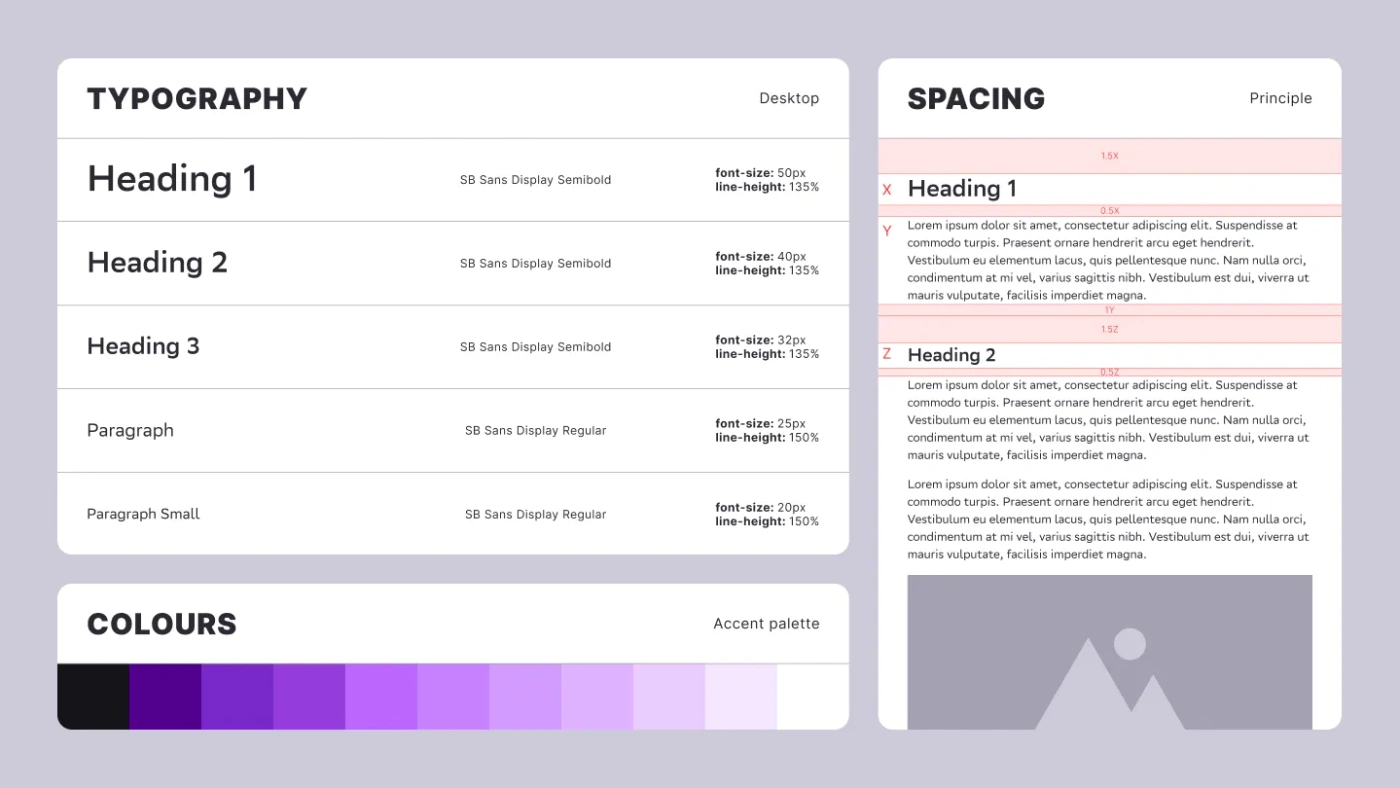
The parent brand supplied SB Sans Display, a logo, and a pictogram. I selected violet from the available colour directions, refined its tone, and built a broader palette. Type hierarchy, spacing, and layout were defined in relation to the body-text size.
The system had to work for a small team producing many different communications. Clear rules created a common foundation for website visuals, compact icons, social posts, and enterprise presentations.
Give an invisible service a visual story
Illustration could show what a photograph could not: sound, atmosphere, and the relationship between music and a business setting. Characters and familiar objects made the message concrete, with exaggeration and humour providing room to explain abstract concepts.
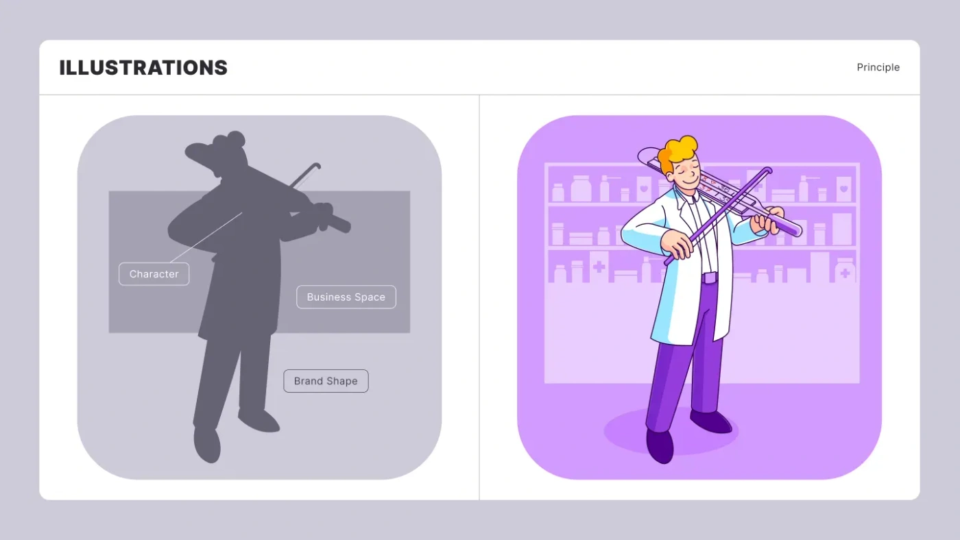
A typical composition combined a character, an industry-specific background, and a rounded brand shape. The character represented a customer, employee, or business owner; the setting established the use case. That repeatable structure made each image recognizable without forcing every story into the same scene.
Build a library, then tailor the story
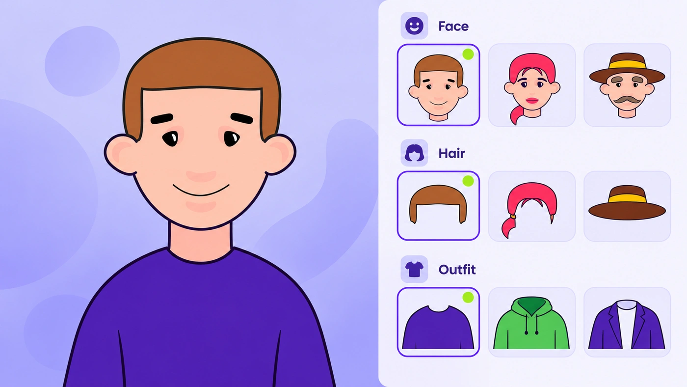
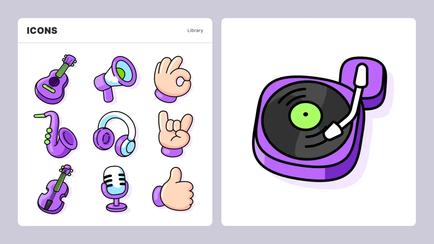
Reusable character and scene elements reduced the need to draw every visual from scratch. The same library could support different industries, and colours could be adapted for client-specific presentation contexts.
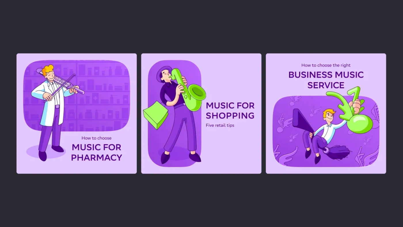
Social graphics paired illustrations with a clear title and subtitle. A contrasting green accent and variations of the rounded brand shape kept the feed varied while retaining the violet-led identity.
Carry the language into sales and web
Enterprise sales needed tailored presentations rather than one generic deck. Illustration gave those decks a flexible way to represent the prospect’s business context. Website visuals used the same vocabulary to explain the service and its applications.
Across my work with the team, the visual toolkit supported more than 40 website pages and over 200 presentations. Reusable elements let us tailor the work to different clients while retaining a consistent visual language.