Brand Identity for Crypto Payment Product
Project Overview
Cryptonix is a crypto payment processor that needed to stand out in a market dominated by similar visual conventions. My role was to build a distinctive brand identity and scale it across key company touchpoints, including the website, newsletter, pitch decks, social media, merchandise, and exhibition stands.
- Client: Cryptonix
-
Role: Brand Marketing Designer
- Scope: Brand identity, website, newsletter, pitch decks, social media, merchandise, exhibition applications
- Tools: Figma, Illustrator, After Effects, Photoshop, Blender
- Year: 2025
Challenge
The main challenge was differentiation.
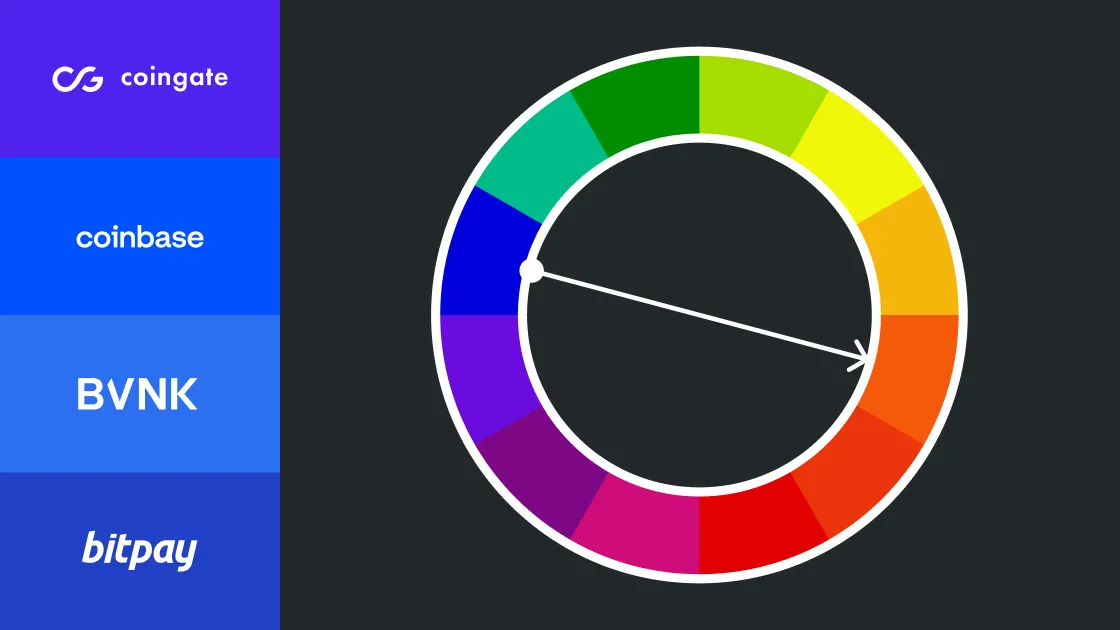
Many fintech and crypto payment brands rely on similar visual language: blue accent colors, neutral grotesque typography, and generic trust/security cues. Cryptonix needed to stand out from competitors while still feeling credible for a corporate B2B audience.
The identity had to be recognizable, but not playful to the point of losing trust.
Solution
The visual direction was built around contrast with the category.
Instead of following the blue-heavy fintech pattern, the identity uses orange as the core accent color. This helped Cryptonix create stronger recognition across digital surfaces and also worked well in physical environments such as dimly lit conference halls and exhibition spaces.
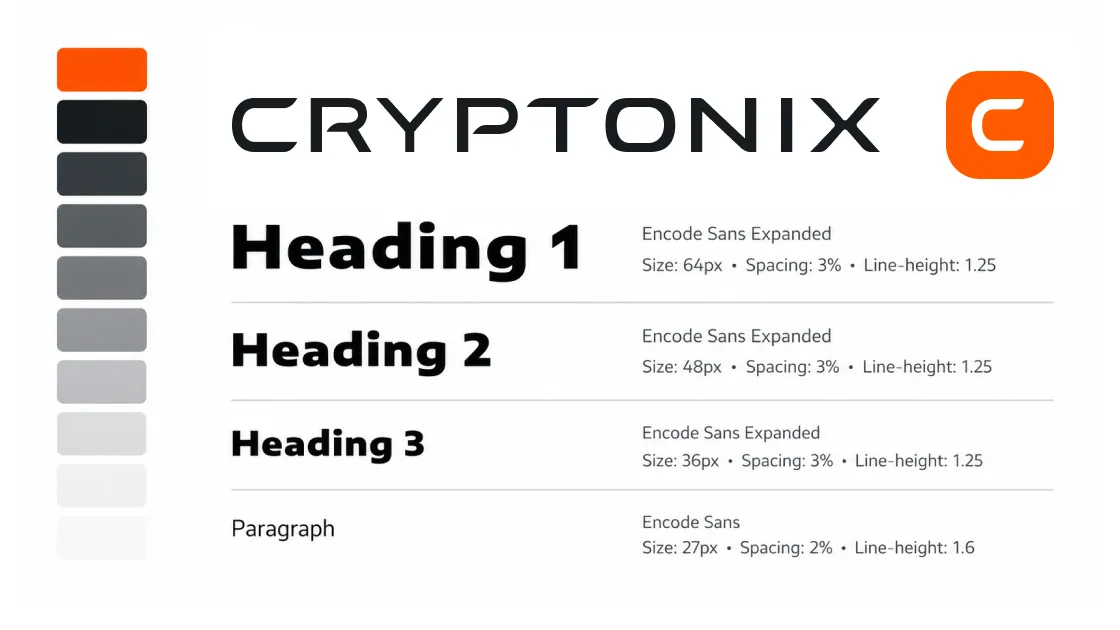
The logo direction followed the same principle. While many competitors use lowercase grotesque wordmarks, Cryptonix moved toward a stronger uppercase block-based signature. The rounded block geometry also subtly connects to the idea of chains, transactions, and infrastructure.
The result is a brand system that feels more ownable without leaving the fintech context.

Deliverables
Brand Identity
A visual identity system built around high-contrast orange, bold typography, and block-based geometry. The system was designed to be simple enough to scale, but distinct enough to stay recognizable across different formats.
Website
Following this direction, we applied the design system to the Cryptonix website, creating an experience that follows industry conventions while feeling fresher and more energetic than competing websites.
Marketing Materials
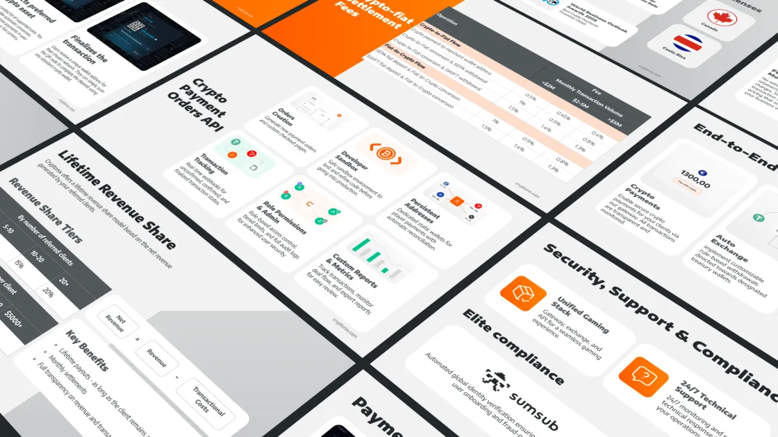
The system was also applied to pitch decks and other sales materials, helping the company stay consistent at every stage of communication.
Social Media
The next challenge was to extend the industry-aligned brand identity into the more visual environment of social media. The Cryptonix Instagram account demonstrates our approach in detail.
Merchandise and Event Applications
The identity was also tested across physical brand touchpoints, including merchandise and exhibition stands. These applications were important because Cryptonix actively participated in industry events, where fast recognition matters.

Outcome
The final system gave Cryptonix a clearer visual position in a market where many competitors look similar. The orange-led identity, uppercase logo direction, and scalable application system helped the brand become more distinct, recognizable, and usable across digital, marketing, and event touchpoints.
Get in touch
More of my case studies
PPC Creatives Under Strict Brand Guidelines
A design system and production workflow for creating performance marketing assets within partner brand guidelines.

Visual Narrative for a B2B Music Service
Visual storytelling, website materials, and sales presentations that helped explain an invisible B2B music service to enterprise clients.